PAOTY Strategy, materials & demo
Paint an oil portrait from life in 4 hours? WHO in their right mind would do that surrounded by cameras, with a celebrity sitter and a live audience in a TV competition?
Yes please! Bring it on!

While preparing for Portrait Artist Of The Year (see earlier blog), my focus was on that pesky four hour time limit. The painting time is broken into two hour-long sessions before lunch, and two after. As the artists are tactfully reminded in the breakfast briefing, it is ultimately a TV show. Each episode entertains over 300k viewers, so we had to be prepared for interruptions: We had to be OK to stop for progress photographs, and to be interviewed while working by the judges, presenters, and production team.
If you’ve watched the show, you’ll already know that each contestant flies the flag for their style. The painters paint, the drafters draw, the printers print, the traditionalists pace back and forth, the funky artists collage and use neon. To grid or not to grid? Take a reference photo, or ride bareback?!
It is a big win just to get through the selection process to appear on PAOTY, but everyone wants to give a good account of their method, offering up their normally solitary process as a spectator sport.
With this in mind, I wanted a reliable hour-by-hour plan, to make best use of the time, and as a security blanket in case I was nervous.
The first decision was what method to use. I was torn between drawing (comfort zone), linocut (secret power), and oils (trusty steed).
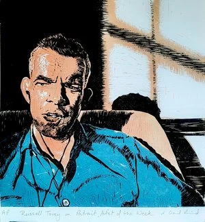

(Russell Tovey and Clare Balding both sat for the world to draw them on Portrait Artist Of The Week - a Facebook livestreamed version of the show, broadcast during lockdown. The oil portrait is of a friend)
Knowing that there have been several fantastic drawing specialist winners (Gareth Reid, Curtis Holder, and Morag Caister), I went with oils. If I ever did Landscape Artist Of The Year, I’d go with linocut - it’s high time a printer won that!
The Storyvault production team ask contestants to list their materials and broad process in advance. Based on this, they go to a great deal of trouble to make sure artists have everything peripheral needed, such as power socket, water, rags, chair, easel, table etc. Perhaps this was also useful information for the filming crew, so they can predict when to hop over and catch artists at good eye-candy moments.
So here it is laid bare for you - my honed process and materials, complete with progress shots for each stage, and an accompanying video. Don’t hesitate to ask questions in the comments, and watch the free demo video (see below), of me using this process to paint my son Tom. Look out for his ad-break, and if that’s not enough Tom for you, watch PAOTY on Sky Arts (released Autumn 2023) to see him in the audience.
Hour 1:
The aim is to decide composition and get a solid underpainting in Burnt Umber acrylic paint. This dries so quickly that once the sitter has had their break at the end of the first hour it will be ready to paint over in oils. Any part of the canvas that I don’t manage/want to paint in oils, will at least be the right value (light/darkness).
Mid tone paper scraps in the same proportion as the canvas, plus a dark and light pencil to sketch composition options with. Using toned paper saves time, and allows me to easily focus on highlights and shadows
Canvas and smaller spare canvas (for emergency restart). I prepared them in advance with a single coat of white acrylic gesso to slightly reduce the absorbancy and texture
Water spray (to help the first wash of acrylic go on better, and slow down the drying a tad)
Nifty water container, with a curved shelf to squeeze the acrylic paint onto. A redundant part from a fridge, the shape is great for controlling the dilution of paint, and all the surplus water runs back in from the brush. I usually use Liquitex (burnt umber) for underpainting
Wide thick absorbant brush to spread the first wash
A wide brush, and one on a stick to allow me to work at a distance when mapping out on a big canvas
Kitchen paper to lift out highlights (and/or rags, which are provided on set)
Uber ruler (made and supplied by Tom Hughes), great for painting straight lines at any angle
Wool (to use as a radius if I need to draw arcs on the canvas, handy if the sitter’s special object is a beach ball)
Mirror (big, lightweight, with a handle - to see the painting and sitter in reverse, which helps me check for errors in my likeness)
Tablet (to take a photo for future reference, once the sitter has settled)
Lucky dragon (made by Tom’s sister Izzi from a post-it note)


At the end of the first hour
Hour 2:
My aim is to block in the image in oil paint, covering as much of the acrylic underpainting as possible in ‘best guess’ colours. I also like to look for exciting colour notes (bright/saturated/dark), to make sure they don’t get lost later. To do this I add the following materials to the mess collection already in use:
Disposable palette. During the sitter’s break (which doesn’t count towards the 4 hours), I take the opportunity to mix up a good supply of the background colour(s). I try to keep some of that set aside, as it is useful for ‘cutting in’ to the subject edges throughout. It is also sometimes useful to mix with the main colours for harmony. In my studio I keep one sheet of palette on the go until it’s unusable. Then I use a palette knife to transfer any reserves of paint from the old sheet to a new one, and add what I need from the tubes.
A small glass jar of medium. I use a combination of paint thinner (Zest-it), medium (Liquin), and cold-pressed linseed oil. I was shown this by Maestro Michael John Angel of The Angel Academy in Florence (during a workshop in Belfast).
Paint thinner/brush wash.
Assorted paints. My go-to colours for portraits are
Burnt Umber & French Ultramarine (I have big tubes of student grade ‘Georgian’ for these, as I use them together instead of black)
Warm White (Michael Harding)
Burnt Sienna
Yellow Ochre (synthetic)
Quinacridone red
Alizarin Crimson
Cadmium Yellow
Cadmium Orange (mid-value warming)
Turquoise (mid-value cooling)
Plus various others as needed
A beautiful wooden brush-holder, made by my friend Ali’s grandad. A range of brushes, mostly flat hog/synthetic bristle, a couple of rounds, and a couple of fine detail sable/synthetic brushes.
A maulstick (or “mahl stick”) that can be screwed together for extra length. Great when working into wet paint in the centre of a large canvas, to avoid smudging what’s already there. Many people use them for steadying too, but I tend to take my chances with an imprecise brushstroke! I love seeing different artists’ variations on the maulstick on the show.
Dart (to scratch in details. I just used this briefly in the hair/eye in the demo portrait of Tom. It came in very handy in the show).
A craft knife. Just in case!

At the end of the second hour
Hour 3:
My aim is to simply progress the picture. At this point, I sometimes use the reference photo to paint from. It can be helpful for fine details, to check relative values (light/darkness of areas). I don’t tend to use it for the big shapes, unless the likeness/proportions are really off. Although photography distorts shape and colour, occasionally it’s helpful when looking for a bit of ‘pop’. So it’s mainly insurance in case the sitter is very mobile, or the painting’s going wrong, or both.
Plus there are only so many times you can ask a celeb, or 11 year old, to stop moving and talking! If you are interested, here is some more about making art from photos and why paint from life.
To maximise the opportunity to abstract the shapes, I generally turn the canvas and the photo.

At the end of the third hour
Hour 4:
This last hour is just about holding steady to the original vision, patiently working round the painting, moving colours and shapes closer to what I observe. I try to keep an eye on design too, softening or completely losing some edges. In this step I get the really small brush out to do fine details, and the dart to scratch out any fine light lines. I try hard not to over-use either, it can be very tempting to start drawing with them.
The fine brush is particularly useful for the sclera (the white of the eye), and the line of the mouth, as tiny variations in these can have a profound effect on the sitter’s expression, and the direction of their gaze. Oh yes, and freckles!
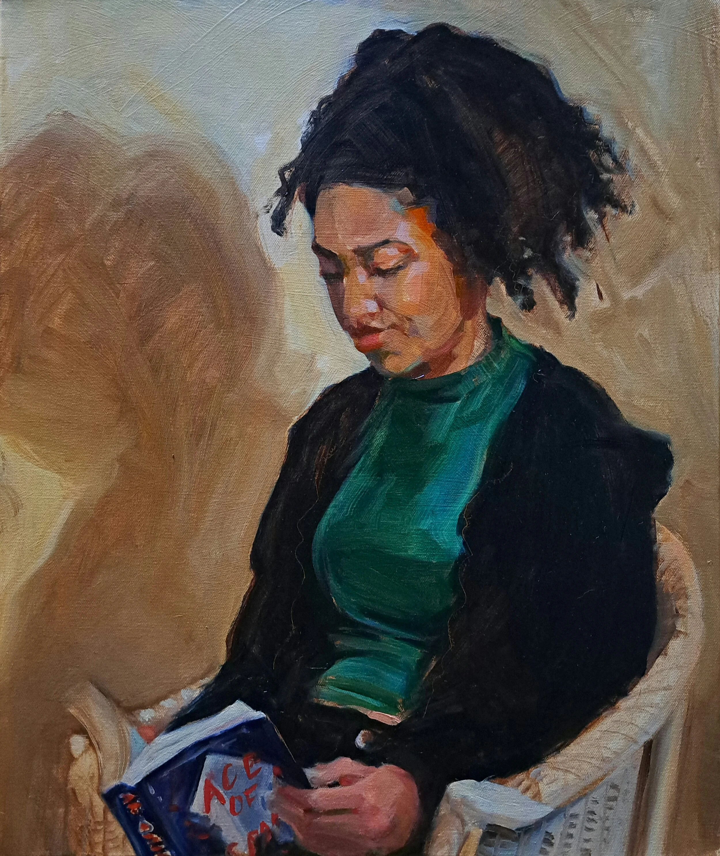
Tom watching - 14 x 18” oil on canvas
For you
It’s not perfect, but to me this captures Tom at the end of primary school, on a rainy day in the summer holidays, engrossed in a video. We tease him about how his eyes do that droopy thing, often when he’s exasperated with his older brother, so I didn’t ‘open them up’ too much.
Tom and I filmed the whole process, so here is a demo of the painting, mercifully shortened to half an hour with timelapses (to save you watching paint dry). Tom’s impersonation of Stephen Mangan at the end needs some work, but his advert made me laugh! Please subscribe to my channel and leave a comment for Tom if you like his performance.
By the way, if you like Tom’s pajamas in the 2nd half, they are from Pajama Pantry. Handmade, they come in all sizes and lengths, in an ever-changing array of fabrics!
My next blog on the Portrait Artist Of The Year experience will be released once the program is aired, but until then… please do follow me on social media, check out all the demos on my YouTube channel, and don’t expect any spoilers!
Subscribe to my newsletter (scroll down below) to receive the next blog as soon as it it published. You will also receive a link to my free guide “6 tips to get the best out of an artist” - a must-read before commissioning a portrait.